


Jacquelyn Sundberg, Outreach Librarian
Colour. For graphic designers and publishers today, colour is a crucial choice for every project, laying the groundwork for the tone of a publication. In the early days of postcards and colour printing, this was even more true. The publishing house Raphael Tuck & Sons set itself apart in the emerging field of colour printing in the late 1800s. The publishing house defined itself and delivered brilliantly coloured paintings, plates, full-colour postcards and illustrated books. Take a tour with me through the history and colour palette of Tuck and Sons, still vibrant after over a century.
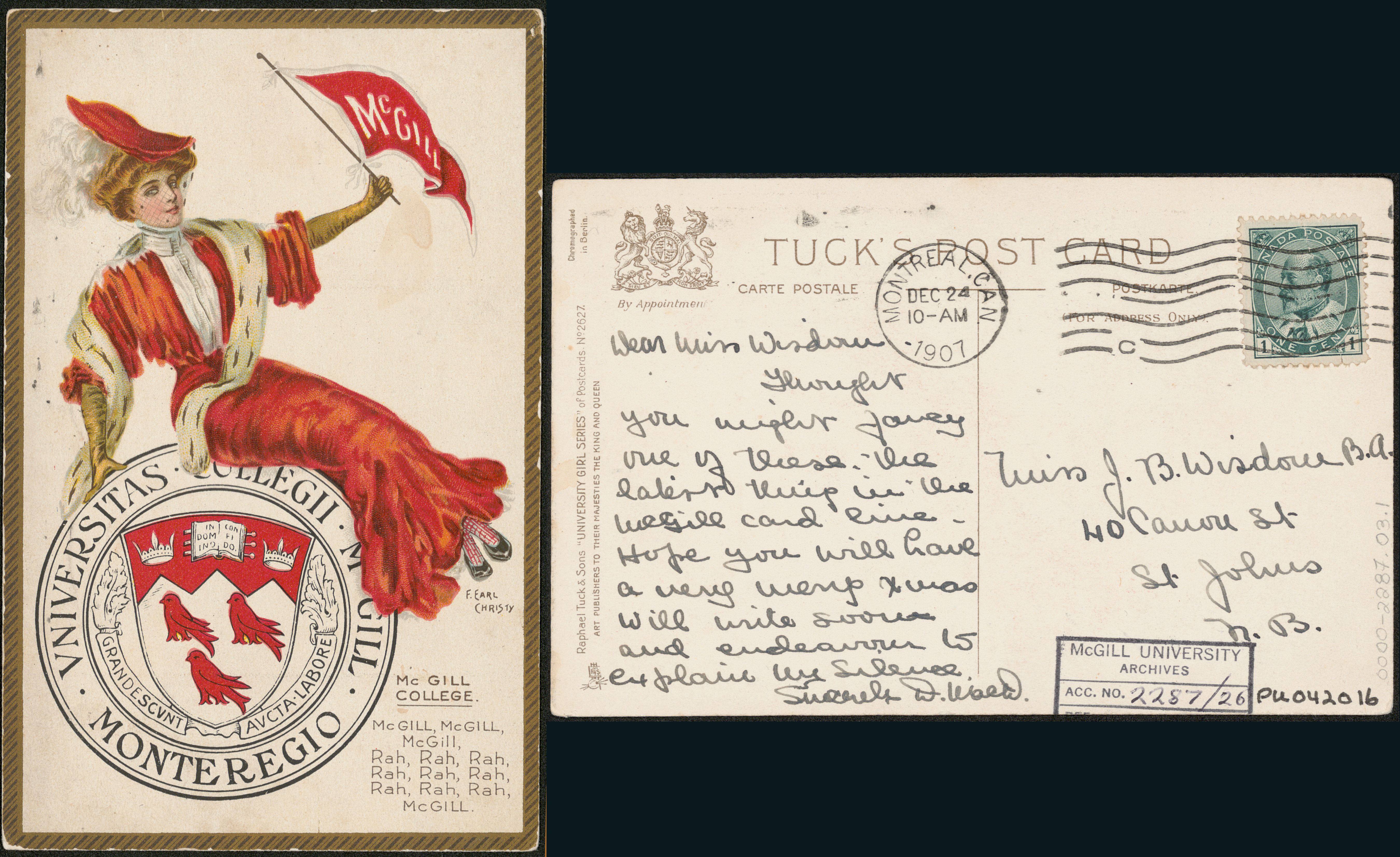
With “postcard fervor” taking over in England in the early 20th century, Tuck emerged as the “epitome of postcard publishers.”[1] In 1899, postal regulations changed in England to allow postcards of a larger size, with images on one side and writing and address information on the back, in part due to the advocacy of Tuck & sons and their fellows. Queue the colourful greeting card boom of the Victorian era and a golden era for Tuck & Sons!
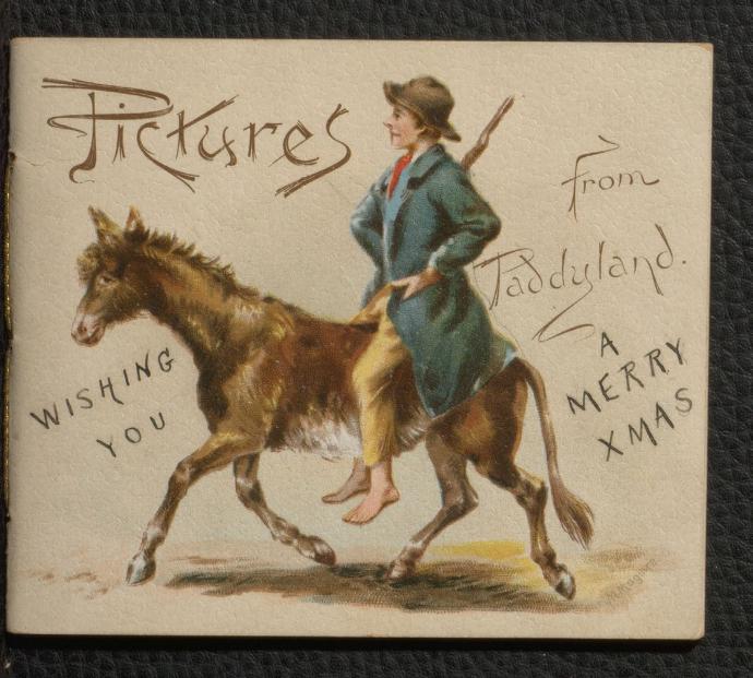
Capitalizing on this booming trade in postcards, Raphael House also published richly illustrated books, annuals for children, anthologies, birthday books, and gift books in vibrant and varied colour palettes.
Foundations
Raphael Tuck & Sons began with a print shop in Bishopsgate, London in 1866, run by Raphael and his wife Ernestine. They specialized in art printing and graphic design, and, up until the first world war, Tuck primarily published cards that were printed in Raphael Tuck’s native Germany, where they specialized in colour chromolithography.[2] This chemical printing technique became the most popular in the 19th century, and used lithograph stones, onto which the image would be drawn, with additional stones for additional detail and colour. Every image would go through the press multiple times, once for each colour present. Rather than specializing in this complex printing technique, Tuck and sons focused on a few core foundations: editing, graphic design, and developing a keen eye for the commercial art market. They went on to solicit artwork for their eventual postcard series with nationwide calls and contests. The house both drove and benefitted from the boom in postcard popularity.
Prompted in part by a reduction in the cost of postage in the UK in 1871 and the addition of Adolph Tuck to the firm that year, the firm printed its first Christmas greeting cards. They moved into greeting card publication on a larger scale after that point, later establishing offices in New York (1900) and satellite offices in Montreal, Berlin, Paris, and Toronto. The firm earned the nod and seal of Her Majesty Queen Victoria in 1883 and continued to be the publisher to the royal family following her death.
Sadly, the firm’s records and archives were destroyed along with Raphael House in the London blitz on December 29th of 1940.[3] That night they lost seventy-four years of company history and roughly 40,000 original pictures and photographs. Though the company continued on, it never returned to its former prominence. Today there is more information on the history of the firm with contributions made by postcard collectors and scholars in North America and the UK.[4] Tuck and sons showed a grounding commitment to excellence across the entire range of their designs, which, along with a keen eye for commercial art and engagement, makes their works still vibrant after 150 years.


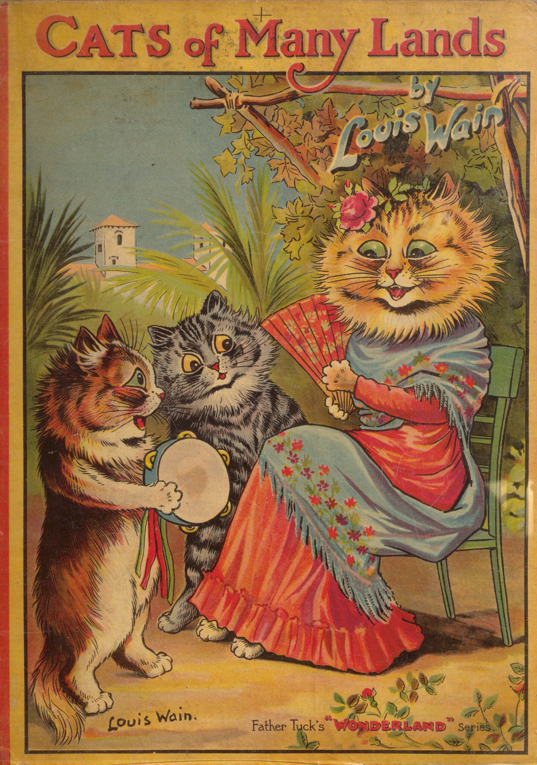
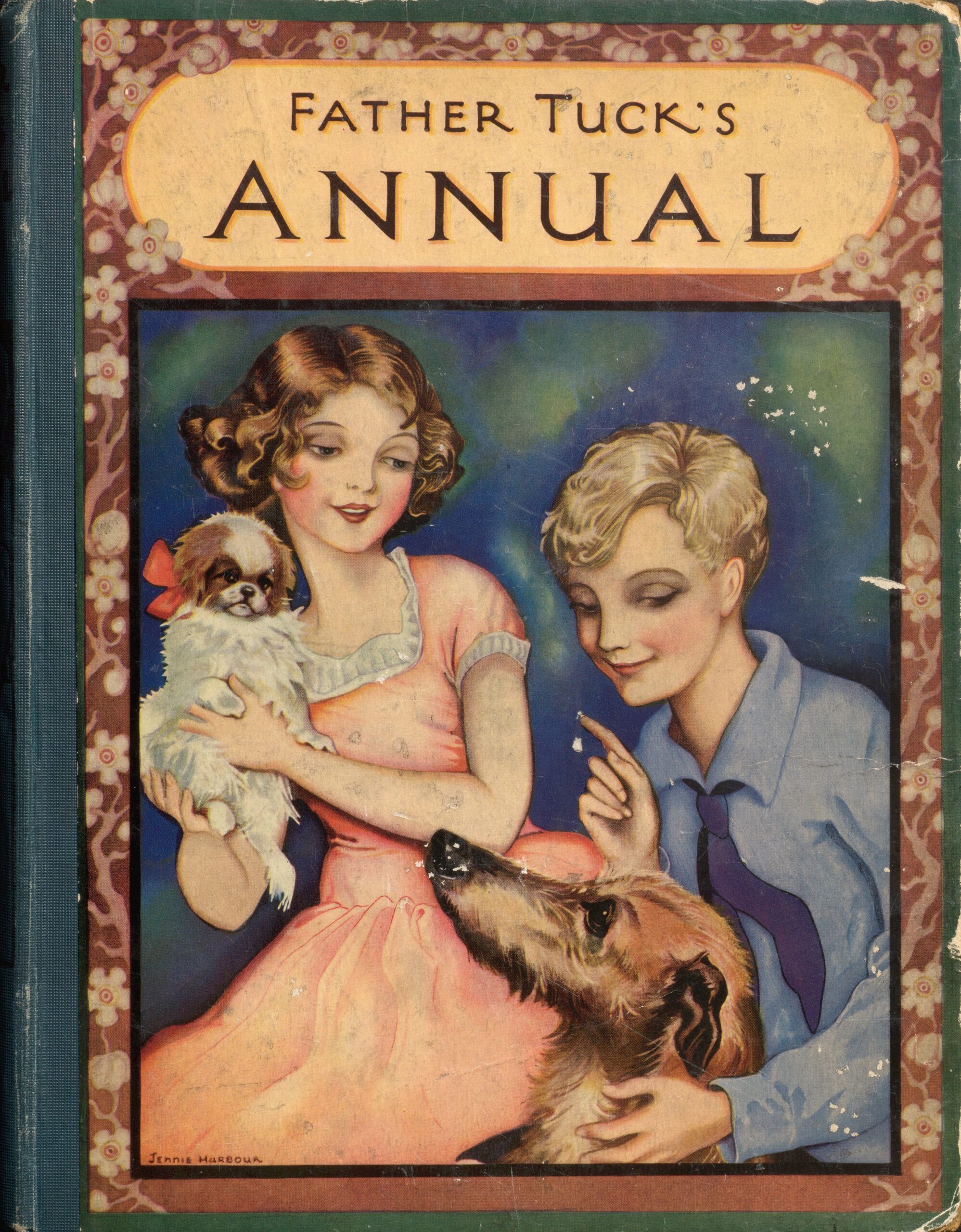
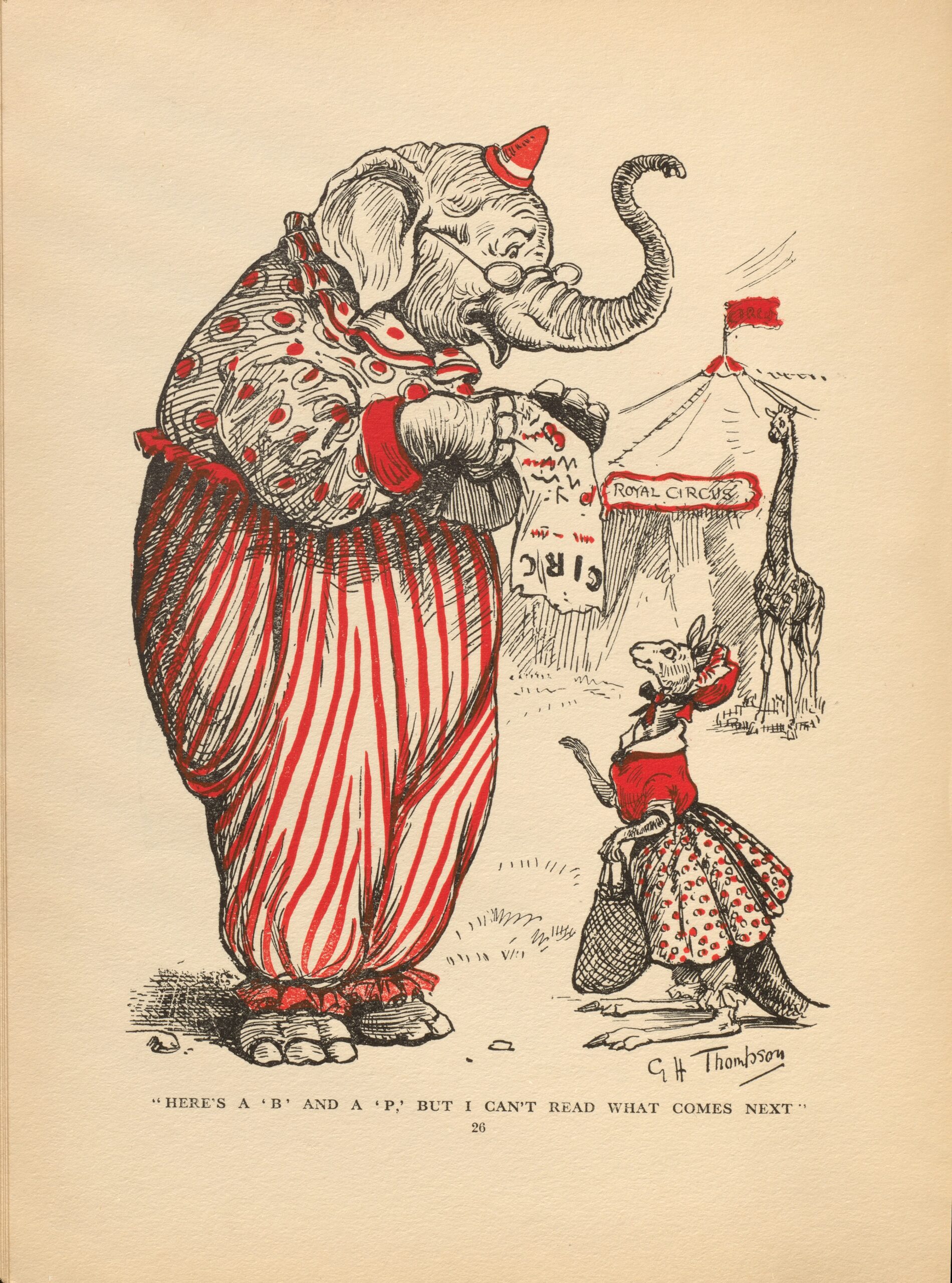
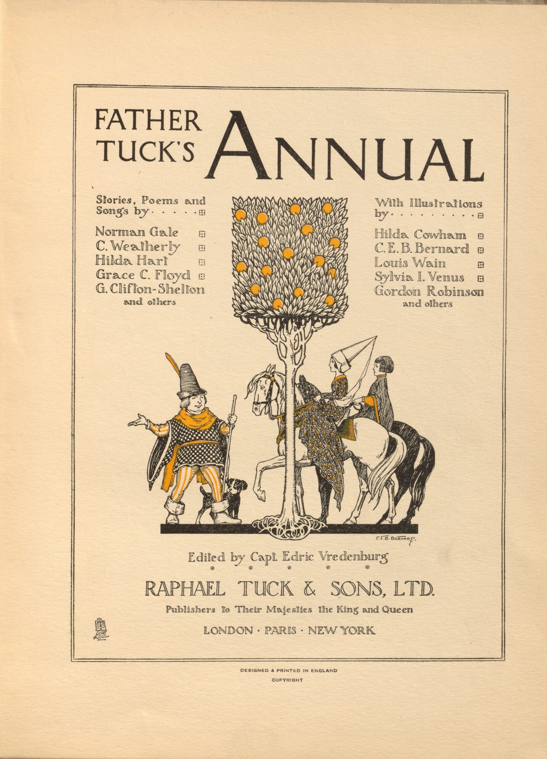
The “Father Tuck’s” series included illustrated annuals for boys and girls, combining fiction, games, comics, illustrations, science writing, and more. The annuals were beautifully produced, although not always with full-colour lithographs as the above left illustration “Cats of Many Lands” by Louis Wain was, they were produced in duotone with some elements using a four-colour process. All Tuck products feature the “easel and palette,” the trademark of the firm which makes spotting their products a simple process.
[1] Sally Carver. The American Postcard Guide to Tuck. Carves Cards: Massachusetts, 1976. (p.4)
[2] History of Raphael Tuck & Sons LTD. https://tuckdbpostcards.org/history
[3] Sally Carver. The American Postcard Guide to Tuck. 1st ed., Carves Cards, 1976. 8.
[4] See Sally Carver’s work, The American Postcard Guide to Tuck. 1st ed., Carves Cards, 1976. https://mcgill.on.worldcat.org/oclc/2932690
Couleurs et cartes : les fondations de Tuck & Sons
Jacquelyn Sundberg, Bibliothécaire de sensibilisation, ROAAr
De nos jours, la couleur est l’élément clé de chaque projet du designer graphique et de l’éditeur puisqu’elle donne le ton d’une publication. Et c’était encore plus vrai à l’ère de la naissance des cartes postales et de l’impression couleur. La maison d’édition Raphael Tuck & Sons s’est taillé une place de choix dans l’impression en couleur qui en était à ses balbutiements à la fin du XIXe siècle. Elle s’est illustrée et s’est définie par ses tableaux, planches imprimées, cartes postales et livres illustrés hauts en couleur. Accompagnez-moi au cours d’une visite de l’histoire et de la palette de couleurs de Tuck and Sons qui sont toujours aussi éclatantes après plus d’un siècle.
Au début du XXe siècle, alors que la « vogue de la carte postale » envahit l’Angleterre, Tuck représente l’incarnation de l’éditeur de ces créations[1]. En 1899, en partie sous l’impulsion de Tuck & Sons et de leurs confrères, de nouveaux règlements postaux entrent en vigueur en Angleterre pour permettre le recours à des cartes plus grandes qui portent une image au recto et un espace réservé au message et à l’adresse au verso. Et c’est l’essor des cartes de l’ère victorienne et de Tuck & Sons qui traverse une période dorée!
Tirant parti de l’expansion du commerce des cartes postales, Raphael House publie également ouvrages aux illustrations riches, annuaires pour enfants, anthologies, livres d’anniversaire et livres cadeaux dans des palettes riches et multicolores.
Pictures from Paddyland, de Bruce Wade, et Helena Maguire, illustratrice, design d’Ernest Griset. Londres : Raphael Tuck & Sons, imprimé en Saxe. Collection Sheila Bourke, division des Livres rares et collections spécialisées de la Bibliothèque de l’Université McGill.
Les origines
À ses débuts, soit en 1866, Raphael Tuck & Sons ouvre un atelier d’imprimerie sur la rue Bishopsgate, à Londres, dont Raphael et sa femme Ernestine tiennent les rênes. Ils se spécialisent dans l’impression d’œuvres artistiques et de design graphique et, jusqu’à la Première Guerre mondiale, publient surtout des cartes imprimées en Allemagne, patrie d’origine de Raphael Tuck, spécialisée en chromolithographie[2]. Cette technique d’impression chimique, la plus courante au XIXe siècle, fait appel à des pierres lithographiques où des images sont dessinées auxquelles s’ajoutent d’autres pierres portant des couleurs et des détails supplémentaires. Chaque image se retrouve sous les presses de nombreuses fois, soit une par couleur. Plutôt que de se spécialiser dans cette technique complexe, Tuck and Sons s’attache à d’autres fondements : édition, design graphique et observation avertie du marché de l’art commercial. La maison lance appels et concours à l’échelle nationale pour solliciter des œuvres destinées à leur série de cartes postales. Elle provoque le boom de popularité des cartes postales tout en en profitant.
Sous l’impulsion, en partie, du coût des envois postaux au Royaume-Uni en 1871, et l’arrivée d’Adolph Tuck la même année, l’atelier produit ses premières cartes de Noël. Par la suite, elle passe à l’impression de cartes de vœux à grande échelle et ouvre des bureaux à New York (en 1900) et des établissements satellites à Montréal, Berlin, Paris et Toronto. L’atelier obtient la faveur et l’agrément de Sa Majesté la reine Victoria en 1883 et reste l’éditeur de la famille royale après le décès de la souveraine.
Malheureusement, les dossiers et les archives de l’établissement sont détruits, de même que la Raphael House, le 29 décembre 1940, pendant le Blitz de Londres[3]. Cette nuit-là, soixante-quatorze années de l’histoire de l’entreprise et quelque 40 000 images originales et photographies s’envolent en fumée. Si l’entreprise poursuit ses activités, elle ne retrouve jamais sa place dominante. De nos jours, on peut trouver davantage d’information sur l’histoire de l’établissement grâce aux contributions de collectionneurs de cartes postales et d’érudits en Amérique du Nord et au Royaume-Uni[4]. Tuck and Sons a démontré un engagement indéfectible à l’appui de l’excellence dans l’ensemble de ses designs, qui, couplé à son flair pour l’art commercial et à son engagement, n’ont rien perdu de leur lustre 150 ans plus tard.
Les séries du Père Tuck sont composées d’annuels illustrés destinés aux filles et aux garçons qui combinent fictions, jeux, illustrations, science et plus. Si la facture des annuels était magnifique, ces publications ne présentaient pas toujours de lithographies affichant de nombreuses couleurs comme dans les illustrations ci-dessus de Louis Wain qui étaient plutôt bicolores et comportaient des volets quadricolores (ci-dessus, à droite). Tous les produits Tuck portent la touche du « chevalet et de la palette », marque de commerce de l’établissement, de sorte qu’ils sont facilement reconnaissables.
[1] Sally Carver. The American Postcard Guide to Tuck. Carves Cards: Massachusetts, 1976. 4.
[2] History of Raphael Tuck & Sons LTD. https://tuckdbpostcards.org/history
[3] Sally Carver. The American Postcard Guide to Tuck. 1ere ed., Carves Cards, 1976. 8.
[4] Voyez Sally Carver’s work, The American Postcard Guide to Tuck. 1ere ed., Carves Cards, 1976. https://mcgill.on.worldcat.org/oclc/2932690.


Leave a Reply
You must be logged in to post a comment.